
Full Scope Brand Identity
In Collaboration with Nealin Parker & Faitth Brooks | Search for Common Ground


The Challenge
Common Ground USA needed a brand identity that could bridge divides—political, cultural, and generational. As a nonpartisan initiative rooted in conflict transformation, they required a brand that avoided language and visuals coded for any particular ideology. The goal was to be bold without being polarizing, credible without being stiff, and approachable without losing depth—especially as they entered the U.S. public affairs space with a mission to transform conflict into community.
The Approach
We began by identifying the key tension: how to convey gravitas and optimism in equal measure. The visual and verbal identity needed to resonate with everyone from policy professionals to grassroots organizers, from college students to community elders. Through deep listening and iterative design, we prioritized four guiding principles in the brand’s visual expression: commonality, clarity, conviviality, and conversation.
Our verbal work embraced voice qualities that are responsive, confident, and creative. We shaped tone rules that promote human-to-human connection and rooted the messaging in Common Ground USA’s values: love anyway, generative listening, and embracing conflict to pursue collaboration.

The Solution
At the core of the new identity is a simple, evocative brand mark: the letterforms C and G interlock to form mirrored speech bubbles in negative space. This creates a symbol that feels both grounded and dynamic—the top and bottom reflect one another, visually underscoring the organization’s commitment to mutual recognition across difference. The curves are warm and inviting, while the central rhombus acts as an eye—a metaphor for truly seeing and being seen.
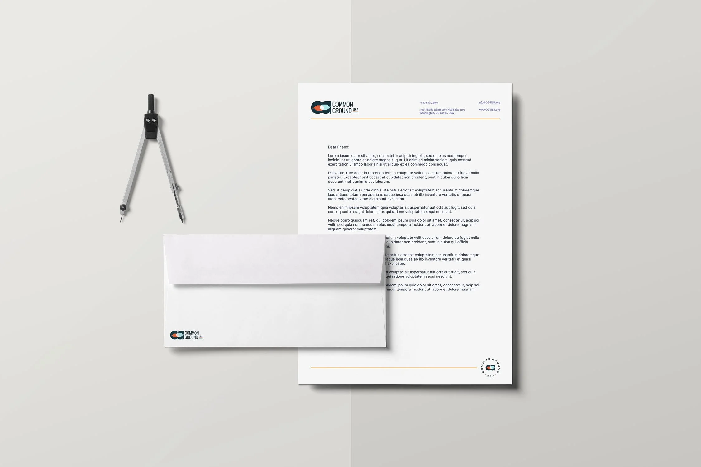
From there, we built out a full brand system:
A modern, accessible website that clearly communicates CGUSA’s mission and programs
Stationery and communication templates to ensure brand consistency across internal and external messaging
A versatile slide deck for trainings, speaking engagements, and donor presentations
Custom iconography that supports storytelling across platforms
A set of backgrounds for use in social media, video calls, and presentations
The typography, color palette, and graphic language—all inspired by American landscapes—work together to create a brand that is trustworthy, energetic, and distinctly its own.

The Impact
With this refreshed brand identity, Common Ground USA now shows up with greater clarity, cohesion, and credibility. The visual system reflects their mission of transforming conflict through community, while the verbal identity creates space for nuance, warmth, and action. Internally, the style guide has empowered the team to show up consistently across platforms—from Instagram posts to white papers—without diluting their voice. Externally, the mark has become a visual shorthand for what CGUSA stands for: bold vision, shared humanity, and the hard-won hope that we can solve big problems together.